
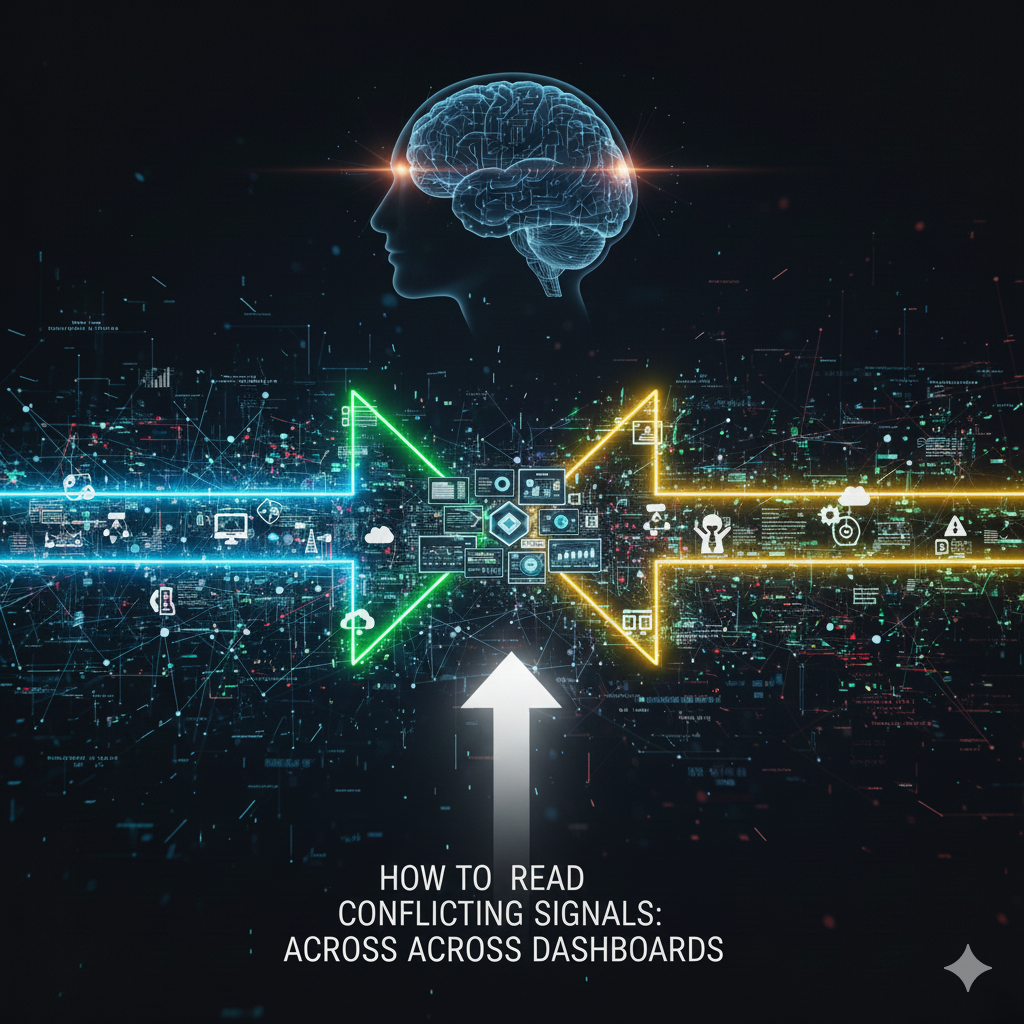
How to Read Conflicting Signals Across Dashboards
In modern analytics environments, teams often rely on multiple dashboards to monitor performance. While dashboards improve visibility, they can also create confusion, as different dashboards may display conflicting trends, leaving teams unsure which numbers to trust. These discrepancies are rarely errors.
To make sense of these differences, tools like a Campaign insight scanner provide interpretation layers that highlight what matters most, helping teams understand why metrics diverge. Using such tools ensures that teams focus on actionable insights instead of chasing misleading fluctuations.
In e-commerce environments, this challenge becomes more pronounced as AI-driven systems increasingly power pricing, personalization, and demand forecasting, making clarity across dashboards critical for growth strategies, such as those discussed in modern AI development services for e-commerce.
Why Conflicting Signals Appear
Conflicting metrics across dashboards are common even when the data is accurate. Understanding why these discrepancies exist is the first step toward reliable insights.
Differences in Data Sources
- Some dashboards pull data from ad platforms, others from CRM systems
- Metrics may measure slightly different actions or audiences
- Variations in source timing or refresh rates can make trends appear inconsistent
For example, an ad platform may report impressions in real time, while the CRM records only completed conversions at the end of the day. Comparing these dashboards without considering timing differences can make it appear as though performance is dropping, when in fact it is simply a reporting delay.
Variations in Calculation Methods
- Metrics like conversion rate, engagement, or ROI can be calculated differently across dashboards
- Attribution models and filters influence the values presented
- Without understanding the underlying formula, comparisons may be misleading
Even within the same organization, two dashboards can define “conversion” differently. One may include only purchases, while another counts leads submitted. Recognizing these variations is critical before concluding.
Common Types of Conflicting Signals
Dashboards often surface conflicting signals in predictable ways. Recognizing these patterns helps prioritize which discrepancies to investigate.
Metric Discrepancies
- The same metric shows different values in different dashboards
- Minor variations may be expected, but large differences warrant analysis
Large discrepancies often indicate differences in aggregation methods or incomplete data imports. Spotting these early prevents teams from making decisions based on flawed comparisons.
Trend Divergence
- One dashboard shows growth while another indicates decline
- Usually caused by differences in date ranges, filters, or aggregation methods
For instance, a dashboard tracking weekly engagement may show positive trends, while a monthly summary indicates a decline. Understanding the reporting period and the context of metrics is essential to interpreting these differences correctly.
Alert Conflicts
- Some dashboards flag anomalies that others do not
- Automation alone cannot explain which signals are critical versus noise
Automated alerts can help identify irregularities but may also create false alarms if thresholds are set without considering normal business cycles or seasonality.
How to Analyze Conflicting Signals
Instead of guessing which dashboard is correct, teams can adopt structured analysis. A systematic approach ensures that discrepancies are interpreted accurately and efficiently.
Steps to Reconcile Differences
- Identify the data sources for each dashboard
- Compare definitions and calculation methods for key metrics
- Check the time ranges and aggregation methods used
- Document business events or promotions that may affect metrics
- Use interpretation tools like Dataslayer data workflow to align and validate signals
Clear documentation becomes even more important when analytics outputs are repurposed into reports, summaries, or AI-assisted content, where consistency relies on structured inputs similar to workflows used in a free AI writing assistant power guide.
Best Practices
- Maintain a single source of truth for critical metrics
- Communicate metric definitions across teams to reduce misinterpretation
- Treat conflicting signals as insights, not errors. They reveal context that may otherwise be overlooked
- Periodically review dashboards and update definitions as business practices evolve
Using these best practices helps teams avoid wasting time on chasing apparent problems that are actually reporting differences.
The Role of Interpretation Layers
Interpretation layers help teams see beyond raw numbers. They surface the most important discrepancies, suggest likely causes, and provide context for decisions. Using tools like a Campaign insight scanner ensures that analysts focus on meaningful differences rather than minor fluctuations.
Benefits
- Quickly identify which signals require action
- Reduce time spent debating metrics
- Ensure consistency across reports and teams
- Improve confidence in decision-making by providing clear explanations for trends
By incorporating interpretation layers into the analytics workflow, organizations can transform dashboards from static reporting tools into actionable insight platforms.
Conclusion
Conflicting signals across dashboards are inevitable, but they do not have to cause confusion. By understanding data sources, calculation differences, and business context, teams can interpret discrepancies effectively. Reading conflicting signals is less about picking the correct number and more about understanding the story behind the metrics.
Structured approaches, combined with interpretation layers and alignment tools, help teams make faster, more accurate decisions while reducing the risk of misinterpretation.