
Ever looked at a brand guide and thought… okay, now what? Pages full of colors, fonts, tone notes, logo rules. On paper, it all makes sense. But turning that into a real video, ad, or visual story is a whole different game. That is where commercial production companies step in. We do not just read brand guidelines. We live with them, question them, sometimes argue with them a little… and then turn them into visuals that actually feel right.
Let us walk through how this really happens, without the fancy talk.
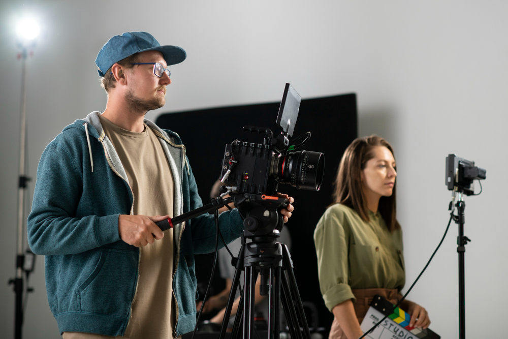
It Always Starts With Listening, Not Shooting
Before cameras, lights, or storyboards, we talk. A lot. We sit with the brand team and ask questions that may sound basic, but they matter. Who are you really talking to? What do you want people to feel, not just see? What should never happen on screen?
There is a reason for this. A study by Lucidpress found that consistent brand presentation can increase revenue by up to 33 percent. That consistency does not come from guessing. It comes from understanding the brand voice deeply, even the parts that are not written down.
Sometimes a brand guide says “friendly and bold,” but the real vibe is calm confidence. We catch that only by listening.
Turning Words Like “Bold” and “Friendly” Into Images
Brand guidelines love words. Bold. Clean. Approachable. Premium. Sounds nice, right? But visuals do not speak in words. They speak in color, framing, movement, and pacing.
If a brand says “bold,” we ask… bold how? Fast cuts? Strong contrast? Confident camera moves? If it is “friendly,” maybe softer lighting, real people instead of models, and moments that feel lived-in.
This is where experience kicks in. According to research from the Nielsen Norman Group, users form first impressions of visual design in as little as 50 milliseconds. That means one wrong visual choice can break the brand feel instantly.
So yes, we sweat the small stuff.
Color and Fonts Are Rules, Mood Is the Real Goal
Yes, brand colors matter. Fonts matter too. We follow those rules closely. But here is the thing… colors behave differently on screen than on paper. Lighting changes them. Skin tones change them. Motion changes them.
We test. We adjust. We sometimes pull back even if the brand color is loud, because too much of it can feel forced on video. Same with fonts. A font that looks great on a website may feel stiff when animated.
We always aim for the mood the brand wants, not just perfect rule-following.
Story Comes Before Style… Always
Here is a hard truth. No one remembers a brand video just because the logo was placed perfectly. People remember stories. Short ones. Simple ones. Real ones.
A report from Harvard Business Review shows that emotionally connected customers are more than twice as valuable as highly satisfied customers. That emotional link comes from story, not polish.
So we build a simple story that fits the brand. Sometimes it is a day-in-the-life. Sometimes it is a small problem and a quiet solution. The visuals then grow around that story, guided by the brand rules, not trapped by them.
Collaboration Keeps Things Honest
This part matters more than people admit. Translating brand guidelines is not a solo job. Directors, editors, designers, brand managers… everyone brings a piece.
We share drafts early. We get feedback. Some ideas get cut. Ugh, we have all been there. But that back-and-forth is healthy. It keeps the visuals honest and aligned.
Many commercial production companies that skip this step end up with work that looks nice but feels off-brand. And that disconnect shows.
Real Brands, Real Consistency
Here is a real-world example. Brands like Coca-Cola and Apple update their visuals often, but you always know it is them. Why? Because they stick to core visual cues… tone, pacing, emotion… not just logos.
Studies from Forbes highlight that strong brands focus on recognizable patterns rather than rigid repetition. That is exactly how visuals stay fresh without losing identity.
That balance is what we aim for every time.
Bringing It All Together
At the end of the day, translating brand guidelines into visuals is about respect. Respect for the brand, the audience, and the story being told. We read the rules, but we also read between the lines.
When media production company get this right, the result does not feel like a checklist. It feels natural. Like the brand is speaking without trying too hard.
And honestly, that is the goal every single time.