
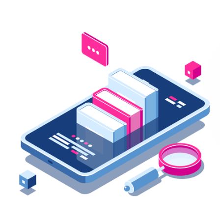
Reading an ebook should feel smooth and inviting, but too often it doesn’t. Cramped text, cluttered layouts, and broken links make readers lose interest, even when the content is strong.
That’s where ebook design services step in. A skilled designer crafts a layout that guides the eye, selects fonts that enhance readability, and ensures the flow keeps readers turning pages.
Smart design eliminates distractions like poor spacing or tiny margins and adds value with features such as a clear table of contents and consistent navigation.
The result? An ebook that looks professional, adapts to any screen, and encourages readers to stay engaged, absorb more, and share the experience.
Let us find out HOW!
1. Clean Layout That’s Easy On The Eyes
A clean layout keeps readers from getting lost. Designers set proper margins, line spacing, and paragraph breaks so the page breathes.
With Ebook Design Services, that craft becomes a steady system that avoids long walls of text and uses short paragraphs with clear headings. White space guides the eye and gives the brain rest.
On small screens, a good layout adapts so lines aren’t too long and the text stays crisp. When the page feels neat and steady, people stay with the story instead of fighting the format.
2. Strong Typography That Guides The Eye
Great ebooks use fonts that are readable and calm. Designers pair a clear body font with a bold, friendly heading font. They set size and spacing so words scan well at arm’s length.
- Use a simple, high-legibility body font.
- Keep font sizes large enough for phones and tablets.
- Set line spacing and paragraph spacing for easy scanning.
When type is done right, readers don’t notice it. They just keep going.
3. Color And Contrast That Improve Focus
Color should help, not distract. Designers choose a text color that has strong contrast with the background so letters stand out without glare. They use color lightly to mark sections, pull out quotes, or signal tips and warnings.
Links use a consistent color so readers know what they can tap. Good contrast also supports people who read in bright light or dim rooms. Clear, gentle color choices reduce eye strain and make the book feel polished.
4. Skimmable Structure That Respects Time
Many people skim before they commit. Design services build a structure that welcomes both skimmers and deep readers. Headings and subheadings form a clear map.
Lists and pull quotes highlight key ideas. Short summaries at the end of sections remind the reader what is important.
- Divide long chapters into short, named sections.
- Use bullet or numbered lists of steps and takeaways.
- Use previews to set expectations, e.g., in this chapter.
This easy-to-skim flow allows you to easily get in and remain involved.
5. Helpful Navigation And Smart Links
Readers love control. A designer adds a hyperlinked table of contents, steady “back to top” links, and clear chapter numbers. Internal links connect ideas across the book, and external links open in a way that doesn’t trap the reader outside the ebook app.
Footnotes and endnotes are easy to reach and return from. When navigation works, people waste less time tapping and more time reading.
6. Accessible Design For Every Reader
Accessibility isn’t extra; it’s essential. Ebook design services add features that help more people enjoy the book. They mark headings so screen readers can speak to them. They write image alt text that explains charts or photos. They choose colors that meet contrast guidelines.
- Tag headings, lists, and tables for assistive tech.
- Provide descriptive alt text for images and diagrams.
- Avoid tiny text and low-contrast color pairs.
These steps make the book fair, friendly, and legal in many settings.
7. A Professional Cover That Invites Clicks
People do judge a book by its cover, at least at first. A good cover shows genre, tone, and promise at a glance. Designers pick a strong title layout, a clean image, and a color story that stands out in a crowded store grid.
The cover also scales well to thumbnail size, which is how most readers first see it. When the cover sparks curiosity, more people click, sample, and start reading.
Conclusion
Great content deserves great presentation. When an ebook is designed with care, readers notice, even if they can’t say why.
Pages feel smooth. Chapters flow. Quotes pop at the right moments. The book works on a phone in a noisy train and on a tablet at home
A clear table of contents and smart links make it simple to move around. And that strong cover invites people to give the book a try. None of this is fluff. It’s respect for the reader’s time and attention.
Ebook design services turn a static file into a pleasant journey. If you want people to finish your book, recommend it, and come back for more, invest in design. The result is a reading experience that feels human, warm, and worth the time.