Kids buy with their eyes. So do adults. The bag is the first taste. If the pack looks fun, the hand reaches out. That’s why smart candy brands treat the bag like part of the candy.
Here are fresh, real-world design ideas for lollipop Mylar bags that work in 2025.
Go loud with color (but keep one hero)
Pick one hero shade and let it sing. Hot pink with a thin white stripe. Lime green with a tiny neon dot grid. Simple beats messy. One bold shade is easy to spot from five feet away.
Flavor cues that read at a glance
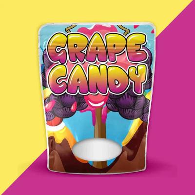
Match the art to the taste. Cherry gets a red swirl. Grape gets a deep purple drip. Lemon gets a bright ring like a sun. Add a tiny icon near the tear notch so shoppers learn the code fast means Custom Mylar Bags.
Clear windows with playful cuts
Use a small see-through shape to show the pops. Heart, star, or a swirl that hints at the stick. Keep the window tight so colors pop inside the foil frame. It builds trust and adds charm.
Matte base, glossy hits
A soft matte bag feels calm in the hand. Add spot gloss on the logo or on tiny “sugar spark” dots. The mix of flat and shine reads premium without a big print bill.
Rainbow foil for shelf pop
Kids love things that shine. A thin rainbow foil stripe along the top seal or a halo behind the logo grabs light. Keep it small so the bag doesn’t look cheap.
Big, friendly type
Choose one chunky font you can read in a blink. Set flavor names huge. Keep lines short: “Sour Cherry.” “Blue Razz.” Avoid thin scripts; they vanish on busy shelves and small screens.
Scan-to-fun QR
Print a small QR near the bottom back. Link it to a 10-second game, a filter, or a joke of the day. Keep the art simple so parents trust the scan. Add “No app needed” in tiny type.
Party-ready sizes
Design a set, not one bag.
-
1-pop mini for checkout hooks.
-
10-count share for lunch boxes.
-
24-count party bag with a hang hole.
Keep the look the same across sizes so the line reads as one family.
Seasonal short runs
Make quick, fun edits for the big dates.
-
Valentine’s: pink bag, tiny gold hearts.
-
Halloween: black bag, glow ink eyes.
-
Winter: icy blue with silver dots.
Swap only two or three plates to save cost.
Tiny jokes and kind notes
Print one short joke on each bag back. Rotate five lines so kids trade them. Or add a kind note: “Share one with a friend.” Small copy makes a brand feel human.
Clean fronts, info on the side
Don’t cram the front. Keep logo, flavor, count. Move facts to the side seam or back: allergens, net weight, maker, store site. Clear layout builds trust and keeps the face bold.
Stick-smart layout
The stick changes the pack shape once filled. Mock it up with real pops before you lock art. Keep key text above the stick “bulge” so it stays readable.
Easy-open, easy-close
Use a smooth tear notch and a zip that seals with a soft click. Add a tiny arrow that says “Tear here.” Parents will thank you. Fewer spills. Fewer sticky hands.
Tactile touches
A light sand-feel varnish or a suede matte makes the bag nice to hold. Kids squeeze packs. Make that moment great. Touch can sell as much as sight.
Eco cues that feel honest
If the film can be recycled or breaks down, say so in plain words. Use leaf icons with care. Don’t paint the bag brown just to “look green.” Real beats fake every time.
Color rules that save cash
Pick a core set: two spot colors plus black, or CMYK with one foil hit. Lock that in your guide. Future edits stay cheap. The line still looks fresh.
Flavor bands for speed picks
Keep one master bag look. Swap only a bold color band at the top seal for each flavor. Stores can face the line by color. Shoppers find their pick in seconds.
Mascot with a job
If you use a mascot, give it a role. The cherry dude points to the tear notch. The lemon pal holds a sign with the count. Cute plus useful sticks in the mind.
Real photos used small
A tiny, crisp photo of one unwrapped pop near the flavor name can boost trust. Keep it no larger than a coin. The bag’s art still leads.
Proof points that matter
Use three short badges max: “Nut-free,” “Made in USA,” “No artificial colors.” Make them small and clean. Too many badges look fake.
Common pitfalls to avoid
-
Don’t place the logo where the hang hole cuts it.
-
Don’t print fine lines near seals; heat can blur them.
-
Don’t rely on pale yellow text on white. It vanishes.
-
Don’t run key copy where sticks poke the film.
Handy spec list (save this)
-
Film: 4–5 mil with foil layer.
-
Seal: top heat seal + zip.
-
Hang: euro hole, 8–10 mm.
-
Window: PET insert or no-film die cut with inside gloss.
-
Finish: matte base, spot gloss logo.
-
Sizes: 1-count, 10-count, 24-count.
-
Art safe area: 5 mm in from all seals.
A quick mock flow that works
-
Sketch a front with three blocks: logo, flavor, count.
-
Drop in a small window and a foil accent.
-
Test print at real size. Tape it to a dummy bag.
-
Fill with pops. Check read at arm’s length.
-
Move anything that hides or warps. Lock plates.
Elevate Your Packaging Game with Innovative Die-Cut Mylar Bags
Why this approach sells
It’s easy to spot. Easy to hold. Easy to open. It looks fun, but it also looks safe and clean. Parents feel good. Kids feel wow. Stores get tidy blocks of color that face well. That mix moves candy.