
Data is often referred to as the backbone of modern decision-making. However, raw numbers alone rarely tell a meaningful story. This is where visualization tools like Power BI come into play. By transforming complex datasets into interactive visuals, Power BI allows teams to interpret trends, make informed decisions, and communicate findings efficiently. A Power BI dashboard sample can serve as a practical starting point for anyone seeking to understand the potential of data visualization without starting from scratch.
Understanding a Power BI Dashboard Sample
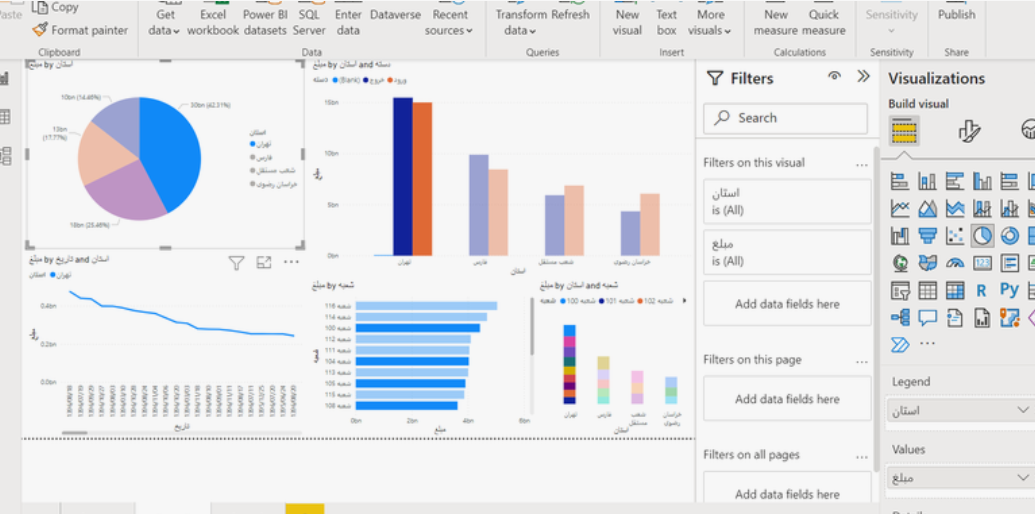
A Power BI dashboard sample is a pre-configured example of how data can be presented using Power BI’s interactive tools. It is not just a template—it’s a demonstration of how data flows from source to insight. Think of it as a miniature model of a city built to illustrate urban planning concepts. While it doesn’t contain real citizens or businesses, it accurately represents the patterns and interactions you might expect in a real scenario.
Key Elements of a Power BI Dashboard Sample
1. Interactive Visualizations
A well-constructed dashboard sample includes interactive elements like slicers, dropdowns, and clickable charts. These features allow users to explore data in multiple dimensions. For example, a sales dashboard sample may let users filter by region, product category, or time period. This interaction not only helps users focus on specific insights but also demonstrates how dynamic visualizations can replace static reports.
2. Realistic Data Representation
While the data in a sample may be hypothetical, it is often structured to reflect realistic scenarios. This includes appropriate ranges for metrics, logical relationships between variables, and patterns that resemble real-world outcomes. For instance, a customer satisfaction dashboard might show higher ratings for loyal clients and lower for new customers, helping users understand patterns without exposing sensitive information.
3. Storytelling Through Layout
The placement of visual elements in a dashboard is critical for understanding the story behind the data. A Power BI dashboard sample demonstrates how to sequence visuals in a logical flow. Key metrics might appear at the top for quick reference, while detailed breakdowns follow below. This helps users understand both high-level summaries and deeper insights.
Benefits of Using a Dashboard Sample
Accelerates Learning
For someone new to Power BI, a dashboard sample can significantly reduce the learning curve. Instead of building visualizations from scratch, users can analyze the sample to understand how data is connected, how formulas are applied, and how visuals are formatted. It’s similar to learning to cook by following a recipe rather than guessing measurements and techniques.
Reduces Errors
When building dashboards from scratch, mistakes in formulas or relationships between tables are common. Samples provide a correct, tested structure that users can study and replicate, reducing the likelihood of errors in their own dashboards.
Sparks Creativity
Viewing a dashboard sample can inspire new ideas for reporting. For instance, a sample focused on employee performance metrics might prompt an HR analyst to track attendance, engagement, or training completion in a similar manner. By examining visual combinations and layout strategies, users gain insights into presenting their own data effectively.
Practical Applications Across Departments
Sales and Marketing
A sales team can utilize a dashboard sample to understand seasonal trends, regional performance, and customer segmentation. By filtering metrics for different quarters or regions, the team can plan campaigns, forecast revenue, and prioritize product lines. For example, a sample may show that certain product categories perform better in urban areas during summer months, providing actionable insights without analyzing raw spreadsheets manually.
Finance
Finance teams often deal with large volumes of numerical data. A sample dashboard highlighting budget utilization, expense categories, and revenue streams can guide finance professionals in tracking cash flow, forecasting expenses, and identifying overspending areas. Seeing a sample in action allows analysts to conceptualize their own dashboards for monthly or quarterly reporting.
Human Resources
HR departments can benefit from a sample dashboard that tracks employee turnover, recruitment pipelines, or performance metrics. By observing the sample’s layout and visual cues, HR teams can develop dashboards that pinpoint trends, such as departments with higher attrition rates, or highlight training needs.
Tips for Maximizing the Value of a Power BI Dashboard Sample
- Analyze the Data Relationships: Pay attention to how tables are connected through relationships. This provides insight into how complex datasets can be managed and visualized effectively.
- Examine Visual Choices: Note why certain charts or graphs were chosen for specific metrics. For example, a line chart may be used to show trends over time, while a bar chart may better compare categories.
- Customize Responsibly: While samples provide a strong foundation, your own dashboards should reflect your unique business context. Replace hypothetical data with real metrics, add or remove visuals, and adjust filters according to your goals.
- Observe Design Principles: Notice how color schemes, font sizes, and spacing are used in the sample. These elements affect readability and comprehension and can inform your own design decisions.
Analogies to Understand Dashboard Samples
Think of a Power BI dashboard sample like a model airplane kit. It’s fully assembled to show what the finished product should look like, but you can remove, modify, or enhance parts according to your preferences. By examining the model, you understand construction techniques, placement of components, and structural relationships, which helps you when building your own airplane from raw materials.
Similarly, the dashboard sample illustrates best practices for data visualization while giving users the flexibility to adapt it to their own datasets.
Conclusion
A Power BI dashboard sample is more than an example—it is an educational and practical tool for understanding the potential of data visualization. By analyzing interactive visuals, realistic data structures, and effective layouts, teams can reduce errors, accelerate learning, and spark creative ideas for their own dashboards.
Across departments such as sales, finance, and HR, dashboard samples provide actionable insights while serving as a foundation for building customized solutions. Whether you are new to Power BI or an experienced analyst seeking efficiency, leveraging samples can improve accuracy, streamline reporting, and help teams make smarter, data-driven decisions.