
What is the last time you deleted an app after just one use? It can be a week before, yesterday, or a few minutes ago. User deletes an app when it is cluttered with unnecessary features, confusing, or just tries to do too much at once.
That is, the silent killer of most of the iOS apps is complexity.
When you work with a professional iOS app development company, the first thing they will tell you is this..
Users don’t want to tap, get what they need, and move on to the next.
And yet, there are hundreds of apps still launched with overloaded screens, buried features, and menus that feel like a maze.
So, let’s talk about why it is so important to keep things simple. And it is not just about a design but a strategy that directly drives retention and engagement.
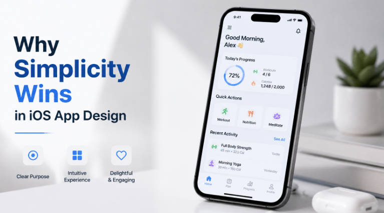
The Psychology Behind Simple Design
Here is a thing about the human brain: they are wired to avoid effort. Too much effort now means procrastination. So, when someone picks up their phone, they are usually mid-commute, half-distracted, or just killing 90 seconds in the queue. They don’t want friction but instant clarity.
That is where the cognitive load concept comes in. The cognitive load is a term that refers to the mental effort a user needs to figure out how your app works. The higher the load, the more chances there are that they will leave. But a simple design reduces that load dramatically.
The most common examples are Notes, Calm, or Duolingo. Three of these are examples of the cognitive load concept. They focus on doing one thing extremely well. And that focus is exactly what keeps the user coming back.
What Simple Actually Means in iOS Design
Simplicity is not the equal of boring. It does not mean that you strip your app down to nothing. Instead,, it means;
- Keep only one primary action per screen
- Visual hierarchy should guide the eye
- Use whitespaces as a feature, not as wasted space.
- The pattern should be consistent
How Simplicity Affects Real Business Outcomes
Keeping your app simple is not about aesthetics anymore. It should also have a measure ble business impact. Here is what the data consistently shows;
- The apps with clear and focused UX see higher user retention rates within the first 30 days.
- Positive reviews almost always mention the easy usage of the app.
- When users understand the app intuitively, they do not need to ask for help as often.
- This makes the first-time experience better and quicker for the users.
Along with all of this, a question that comes up often in these conversations is about the mobile app development cost, and here is what you should know. You are building a simple app, but that does not mean it is cheaper.
Simplxiity takes deliberate effort, and it means making hard decisions about what to cut and what to keep. Also, how to arrange things so they feel effortless to the users. That design thinking is actually where a significant portion of development cost foes, and it is worth every dollar.
Common Mistakes That Kill Simplicity
Even well-intentioned teams make these mistakes when building iOS apps:
- Feature stuffing at launch: Every stakeholder wants their feature included. But launching with too much overwhelms users and dilutes the core value.
- Inconsistent navigation: Mixing tab bars, hamburger menus, and gesture-based navigation in the same app creates confusion.
- Too many fonts and colors: Visual noise is still noise, even when it’s colorful.
- Ignoring thumb zones: On iOS, most users navigate one-handed. Placing key actions out of natural thumb reach breaks the flow completely.
- Skipping user testing: What feels obvious to the person who built it often isn’t obvious to a first-time user.
The Role of Iteration in Keeping Things Simple
Here is a truth that often gets overlooked: simple design isn’t something you get right the first time. It’s something you arrive at through iteration.
The best iOS apps today didn’t launch perfectly. They launched focused, gathered real user feedback, and stripped away what wasn’t working. Twitter’s original timeline, Instagram’s early photo filters, Airbnb’s booking flow: all of these went through rounds of simplification based on how real users actually behaved.
Practical Tips to Design for Simplicity
If you’re starting or refining an iOS app right now, here are a few things to do immediately:
- Define the single most important action your user should take and make it the most prominent element on screen.
- Cut your feature list in half before you start building. Seriously. Then cut it again.
- Use Apple’s native components wherever possible, as they’re familiar to users and reduce design debt.
- Test with real users early, because even informal sessions with five people reveal more than weeks of internal debate.
- Look at your screens without labels: if you can’t understand the purpose of a screen in three seconds without reading anything, it’s too complex.
Conclusion
At the end of the day, simplicity in iOS app design is not a trend. It is one of the most fundamental truths about how people are using technology. Users now want speed with clarity and ease. They want to open your app and accomplish something meaningful and get on with their day.
When you build the app with that mindset, everything else follows: better reviews, stronger retention, and a product people actually recommend to others.
So before you add one more feature or one more screen, first ask yourself honestly. Does this make the experience of your simpler or more complicated? The answer to that question will help you.