
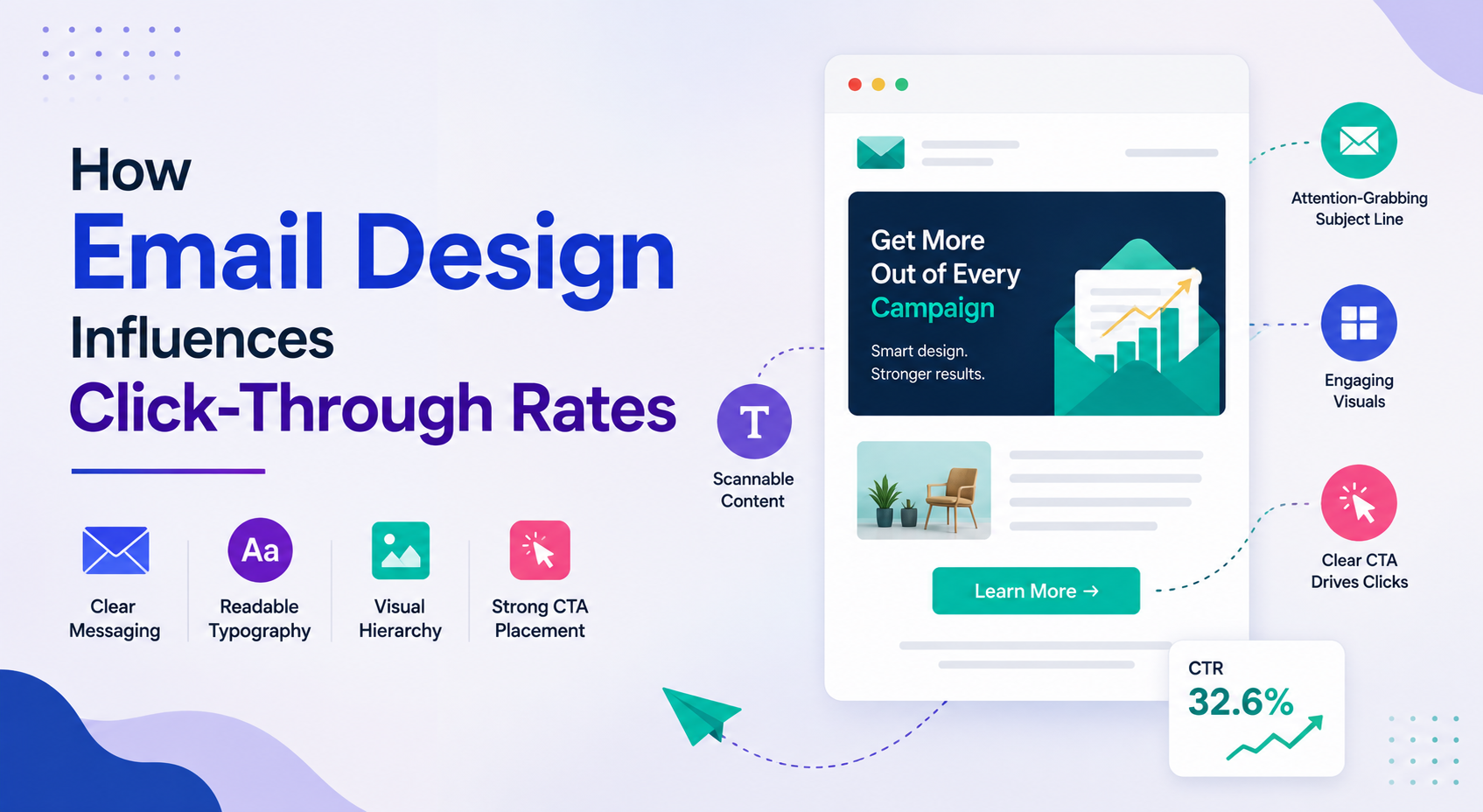
An email can have a strong subject line, a relevant offer, and a carefully selected audience, yet still produce disappointing clicks. Sometimes the problem appears after the recipient opens the message. The CTA is buried, the layout feels crowded, or the main point takes too long to find.
This is where email design services can have a practical role. Professional email design is not simply about choosing attractive colors or adding polished graphics. It is about organizing content so the recipient can understand the message, recognize its value, and find the next step without unnecessary effort.
That distinction matters because an email has very little time to earn attention.
The Click Often Depends on What Happens After the Open
Email marketers often focus heavily on open rates.
That makes sense, but an open only tells the team that someone decided to look at the message. It does not tell them whether the email made the person want to continue.
Once the email opens, the design has a different job.
It needs to establish what the email is about, make the important information easy to scan, and guide the reader toward a relevant action.
A campaign with a high open rate and weak click-through rate may therefore have a problem with the message, offer, layout, CTA, or the connection between those elements.
A Strong Email Has a Visual Starting Point
When someone opens an email, their eyes need somewhere to go first.
That might be a headline, product image, key statistic, or short statement that immediately explains the purpose of the message.
Without a clear starting point, every element competes for attention.
For example, a promotional email could begin with a large product image followed by several paragraphs, multiple links, and a secondary offer. A more focused version might lead with the main benefit, support it with one relevant visual, and then provide a clear CTA.
The second approach gives the reader less work to do.
Too Many Choices Can Reduce Clicks
More links do not necessarily create more opportunities.
They can create indecision.
An email promoting a webinar, whitepaper, product demo, newsletter, and case study at the same time may give recipients several places to click, but none of them feels especially important.
A focused email usually has a primary action.
Secondary links can still exist, particularly when they support the main goal, but the visual hierarchy should make it obvious which action matters most.
CTA Design Matters More Than Button Color
Email discussions often focus on whether a CTA should be blue, green, red, or another color.
Color can help a CTA stand out, but the wording and placement are usually more important.
“Submit” tells the reader very little.
“Get the Research Report” explains what happens next.
“Book a Product Demo” gives a clear expectation.
The CTA should match the commitment being requested. A low-intent reader may be more comfortable downloading a useful guide than scheduling a sales call.
Design Should Match the Reason Someone Opened the Email
The subject line creates an expectation.
If the email promises a report, the reader should be able to find the report quickly. If it promotes a product update, the update should be the central focus.
A disconnect between the subject line and the email body creates friction.
For example, an email titled “5 Ways to Reduce Customer Churn” should not open with a long company introduction. The reader already told the sender what they were interested in by opening the email.
The design should respect that intent.
Mobile Layout Can Make or Break the Click
A large percentage of email reading happens on mobile devices.
That creates a different set of design requirements.
Small text becomes harder to read. Multi-column layouts can become cramped. Buttons may be difficult to tap. Images can push the main CTA far down the screen.
Responsive email design should therefore be tested at realistic mobile sizes, not simply checked inside a desktop email client.
A CTA that is obvious on a large monitor may become easy to miss on a phone.
Images Should Explain Something
Visuals can attract attention, but they should contribute to the message.
A product screenshot can show how a feature works. A chart can make a trend easier to understand. A customer image can add context to a case study.
Decorative imagery has its place, but an email filled with generic stock photography can consume valuable space without giving the reader a reason to click.
The strongest visuals answer a question or reinforce the point being made.
Don’t Let Design Hide the Message
An email can be beautifully designed and still perform poorly.
Large hero images, elaborate animations, unusual fonts, and decorative elements can make a campaign look impressive while pushing the actual message into the background.
This is particularly risky for B2B emails.
The recipient may be reading between meetings and looking for the one thing that matters to them. If the design makes that information difficult to find, visual polish becomes a disadvantage.
Good design creates clarity before decoration.
Personalization Should Affect More Than a Name
Adding someone’s first name to an email is easy.
Useful personalization goes deeper.
The content and design can reflect a recipient’s industry, previous interaction, product interest, or stage in the buying journey.
A customer who has already downloaded technical documentation should not necessarily receive the same email as someone who has only read a general blog post.
When the message reflects what the recipient actually cares about, the design can support that relevance with fewer competing elements.
Give Important Information Enough Space
Crowded emails are difficult to scan.
Spacing between sections, headlines, paragraphs, and CTAs creates a visual rhythm that helps readers move through the message.
Whitespace is not wasted space.
It gives important information room to stand out and prevents the email from feeling like one large block of promotional content.
This becomes even more important when the email contains several sections.
Email Design Should Support Different Campaign Goals
Not every email needs the same structure.
A product launch may need a strong product visual and one primary CTA.
A newsletter may need several sections with clear content categories.
A lead nurturing email may work better with a short educational message followed by a relevant resource.
A customer email may need a simple explanation and a clear account-related action.
Trying to force every campaign into the same template can make emails feel repetitive and less relevant.
Use Testing to Find Design Problems
Design decisions should not rely entirely on personal preference.
Marketing teams can test meaningful changes such as:
- CTA wording
- CTA position
- Email length
- Number of links
- Hero image versus no hero image
- Single-column versus multi-column layouts
- Short versus detailed introductions
The results can reveal something the design team may not have expected.
If a simpler email consistently generates more clicks, that is useful evidence. If a particular CTA placement performs better on mobile, future campaigns can reflect that learning.
Look Beyond the Click-Through Rate
Click-through rate is important, but it should not be viewed in isolation.
A campaign may generate more clicks but fewer qualified leads if the CTA attracts the wrong audience.
Useful measures include:
- Click-through rate
- Click-to-open rate
- Conversion rate after the click
- Unsubscribe rate
- Mobile engagement
- Landing page performance
- Revenue or pipeline influenced
The real question is not simply whether people clicked.
It is whether the email helped the right people take a useful next step.
When Email Design Needs More Strategic Attention
For organizations sending occasional newsletters, basic templates may be enough.
The situation changes when email becomes an important part of acquisition, nurturing, product marketing, or customer communication. Multiple audience segments, campaign types, devices, brand requirements, and testing needs can make email design much harder to manage consistently.
In those cases, Email Design Services can help teams create email experiences around specific campaign goals rather than treating design as a final layer added after the copy is written.
The strongest approach brings messaging, layout, hierarchy, responsiveness, and conversion goals together from the start.
Final Thoughts
Click-through rates are influenced by far more than a button.
The recipient needs to understand the message, recognize why it matters, trust the offer, and know what to do next. Every part of the email contributes to that journey, including the elements that seem purely visual.
The best email design does not demand attention. It directs attention.
When the layout makes the important message obvious and the next step feels natural, recipients have fewer reasons to hesitate. That is where design stops being decoration and becomes part of the campaign strategy.